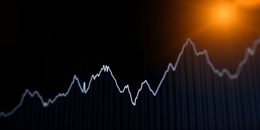
Looking at a stock market graph can seem pretty complicated at first. There are lots of lines and numbers, and it might feel like you need to be a financial expert to understand any of it. But really, knowing how to read these graphs is a basic skill for anyone interested in stocks. It helps you see what’s happened with a stock and guess what might happen next. This article will help you make sense of the stock market graph, breaking down the main parts so you can start to understand what you’re looking at.
Key Takeaways
- Learning the basic words used for a stock market graph helps you understand what’s going on.
- Looking at overall trends and market cycles on a stock market graph shows you the big picture.
- Using tools like trend lines and different chart types helps you read a stock market graph better.
- Advanced methods, like candlestick charts and volume, give you more details from the stock market graph.
- Considering different timeframes, like daily or weekly, changes how you see the stock market graph and helps reduce confusion.
Understanding Core Stock Market Graph Terminology
Defining Key Investment Concepts
Okay, so before we even glance at a stock market graph, we need to be on the same page about some basic ideas. Think of it like learning the alphabet before trying to read a book. First up, you’ve got stocks or shares, which are basically pieces of ownership in a company. If you own stock, you own a tiny bit of that company. Then there’s a portfolio, which is just a fancy word for all the investments you have. It could be stocks, bonds, or even that rare coin collection your grandpa left you. Understanding these terms is key investment concepts for anyone looking to get into the stock market.
Interpreting Market Conditions: Bull and Bear Markets
Now, let’s talk about the mood of the market. You’ll often hear people talking about "bull" and "bear" markets. A bull market is when prices are generally going up – everyone’s feeling optimistic, and it’s a good time to be invested. A bear market is the opposite: prices are falling, and people are getting nervous. Typically, a bear market is defined as a drop of 20% or more from recent highs. Knowing whether we’re in a bull or bear market can help you make smarter decisions about when to buy or sell. It’s like checking the weather forecast before planning a picnic. You want to be prepared for what’s coming. Keep an eye on market conditions to stay informed.
Gauging Market Fluctuations: Volatility and Diversification
Finally, we need to understand how much the market is jumping around. That’s where volatility comes in. Volatility is a measure of how much the price of something is changing over time. High volatility means prices are swinging wildly, while low volatility means things are pretty stable. Diversification is a strategy to manage risk. It means spreading your investments across different things, so you’re not putting all your eggs in one basket. If one investment goes south, you’ve got others to cushion the blow. It’s like having a backup plan for your backup plan. Here’s a quick rundown:
- Volatility: How much prices change.
- Diversification: Spreading your investments.
- Portfolio: Your collection of investments.
Understanding these terms is like learning the rules of a game before you start playing. It might seem boring at first, but it’ll save you a lot of headaches (and money) in the long run.
Analyzing Stock Market Graph Trends

Identifying Overall Market Direction
Figuring out where the market is headed is the first thing you should do. Is it generally going up, down, or sideways? This sets the stage for everything else. You can spot the overall direction by looking at the highs and lows over a period. If you see higher highs and higher lows, that’s usually an uptrend. Lower highs and lower lows? Downtrend. If it’s just bouncing around in a range, it’s likely moving sideways. For long-term investors, a trend line over five years can show long-term growth. Traders might look at a few hours to see what’s happening during the day.
Reviewing Current Trends and Market Cycles
Market trends come from a mix of things like how the economy is doing, what investors are feeling, and what’s happening around the world. Here are some recent trends:
- Tech is changing things: Tech, biotech, and renewable energy companies are doing their own thing because they’re innovating so fast.
- The world is connected: Emerging markets are now part of the global economy, which means stock markets are more connected and influence each other.
- Recovering from the pandemic: As economies bounce back, markets are showing both growth and caution because of inflation and supply chain problems.
- Sustainable investing: People care about ESG (Environmental, Social, and Governance) factors, so investments are shifting towards sustainable growth.
These trends often follow patterns. Understanding these patterns might involve analyzing data using moving averages or Fourier transforms.
The Impact of Economic and Global Events
Economic and global events can really shake things up in the stock market. Things like interest rate changes, inflation reports, and unemployment numbers can all cause big swings. Geopolitical events, such as trade wars, political instability, or major international incidents, also play a big role. For example, a surprise interest rate hike by the Federal Reserve might cause a market sell-off, or a positive jobs report could lead to a rally. Keeping an eye on these events and understanding how they typically affect the market is key. Using an online stock broker can help you stay informed and make better decisions. Also, understanding TradingView Free can help you analyze these impacts.
Reading the Stock Market Graph
Utilizing Trend Lines for Directional Insight
Trend lines are a simple but effective tool. They help visualize the general direction of a stock’s price over a specific period. You draw them by connecting a series of data points on the graph. If the line slopes upward, it suggests an uptrend; downward, a downtrend. Sideways? Well, that indicates a period of consolidation or sideways movement. It’s not rocket science, but it gives you a quick read on where things might be headed. Understanding stock categories is essential for making informed decisions based on these trends.
Understanding Dividend and Stock Split Charts
Dividends and stock splits can make a stock chart look a little funky if you don’t know what you’re seeing. Dividends are cash payments companies make to shareholders, and they can cause a slight dip in the stock price on the ex-dividend date. Stock splits, on the other hand, increase the number of shares you own but reduce the price per share, keeping the overall value of your holdings the same. Charts usually adjust for these splits to provide a clearer picture of the stock’s performance over time. Here’s a quick rundown:
- Dividends: Cash payments to shareholders, potentially causing a price dip.
- Stock Splits: Increase shares, decrease price per share, maintaining value.
- Adjusted Charts: Account for splits and dividends for accurate historical analysis.
Interpreting Line and Bar Charts
Line and bar charts are two common ways to display stock market data. Line charts connect closing prices over time, giving you a smooth view of the stock’s movement. Bar charts, also known as OHLC (Open, High, Low, Close) charts, provide more detail for each period. Each bar shows the opening price, the highest price, the lowest price, and the closing price. Bar charts can be especially useful for spotting tick size chart and volatility within a specific timeframe.
Understanding the difference between these charts is important. Line charts are great for seeing the overall trend, while bar charts give you a more granular view of price action. Knowing how to read both can give you a more complete picture of what’s happening with a stock.
Advanced Stock Market Graph Analysis Techniques
Leveraging Candlestick Charts for Price Action
Candlestick charts are a visual way to represent price movements over time. Each candlestick shows the open, high, low, and close prices for a specific period. The body of the candle represents the range between the open and close prices, while the wicks (or shadows) show the high and low prices for that period. The color of the body indicates whether the closing price was higher (typically green or white) or lower (typically red or black) than the opening price.
- Candlestick patterns can help identify potential buying or selling opportunities.
- Common patterns include the doji, hammer, and engulfing patterns.
- These patterns can provide insights into market sentiment and potential trend reversals.
Assessing Historic Volume for Market Activity
Volume represents the number of shares traded during a specific period. Analyzing volume can provide valuable insights into the strength of a price trend. High volume during a price increase suggests strong buying pressure, while high volume during a price decrease suggests strong selling pressure. Conversely, low volume might indicate a weak trend or a lack of conviction among traders. You can find stock charts on many search engines.
- Volume spikes can signal significant events or changes in market sentiment.
- Divergence between price and volume can indicate a potential trend reversal.
- Analyzing volume in conjunction with price action can improve the accuracy of your analysis.
Calculating Price to Earnings Ratios
The Price to Earnings (P/E) ratio is a valuation metric that compares a company’s stock price to its earnings per share (EPS). It indicates how much investors are willing to pay for each dollar of a company’s earnings. A high P/E ratio may suggest that a stock is overvalued, while a low P/E ratio may suggest that it is undervalued. However, it’s important to compare P/E ratios within the same industry, as different industries have different average P/E ratios. Understanding stock valuation techniques is important for investment decisions.
It’s important to remember that no single indicator or technique is foolproof. Successful stock market analysis requires a combination of different approaches and a thorough understanding of market dynamics. Always consider your own risk tolerance and investment goals before making any trading decisions.
Applying Moving Averages to the Stock Market Graph
Moving averages are a pretty common tool for traders. They help smooth out price data, making it easier to see the underlying trend. Instead of focusing on every little price fluctuation, you get a clearer picture of where the stock might be headed. It’s like looking at the forest instead of individual trees.
Spotting Trend Direction with Moving Averages
Moving averages help identify trend directions by smoothing out price fluctuations. The idea is to filter out the noise and highlight the overall direction of the stock’s price. When the price is consistently above the moving average, it suggests an uptrend. Conversely, if the price is consistently below, it indicates a downtrend. If the price is weaving around the moving average, it might mean the stock is trading sideways.
Simple Moving Average (SMA) for Short-Term Trends
The Simple Moving Average (SMA) is calculated by taking the average of a stock’s price over a specific period. For example, a 20-day SMA takes the average closing price over the last 20 days. It’s a straightforward way to see short-term trends. Here’s how it works:
- Choose a period (e.g., 20 days, 50 days).
- Add up the closing prices for that period.
- Divide by the number of days.
- Plot the result on the graph.
SMA is useful, but it gives equal weight to all prices in the period. This means the most recent price has the same impact as the price from 20 days ago, which might not always be ideal.
Exponential Moving Average (EMA) for Responsiveness
The Exponential Moving Average (EMA) is similar to the SMA, but it gives more weight to recent prices. This makes it more responsive to new information and price changes. It reacts faster than the SMA, which can be helpful for catching trends early. The formula is a bit more complex, but most charting software calculates it automatically. Webull Desktop 4.0 can help with this.
Here’s a quick comparison:
| Feature | SMA | EMA |
|---|---|---|
| Calculation | Simple average | Weighted average |
| Responsiveness | Slower | Faster |
| Use | Identifying trends | Catching trends early |
| Sensitivity | Less sensitive to change | More sensitive to change |
Using moving averages isn’t a foolproof strategy. They are lagging indicators, meaning they reflect past price action. It’s important to use them in combination with other tools and analysis techniques to make informed trading decisions.
Timeframes and Their Significance in Stock Market Graph Analysis
Daily Charts for Short-Term Trading
Daily charts are your go-to if you’re into short-term trading. They provide a close-up view of price movements, showing you what’s happening day-to-day. This level of detail is super helpful for making quick decisions, but it also means you’ll see a lot of noise. Think of it like watching a movie frame by frame – you catch every detail, but it can be overwhelming. For example, traders might use daily charts to spot real-time market data and capitalize on intraday price swings.
Weekly and Monthly Charts for Long-Term Trends
If you’re more interested in the big picture, weekly and monthly charts are your friends. These charts smooth out the daily ups and downs, giving you a clearer view of long-term trends. They’re perfect for investors who are in it for the long haul and want to see where a stock is headed over months or years. These charts help filter out the noise and focus on the overall direction.
Reducing Market Noise with Longer Timeframes
Market noise can be a real headache, especially if you’re trying to make sense of short-term price fluctuations. Longer timeframes help reduce this noise by averaging out the data over a more extended period. This makes it easier to spot genuine trends and avoid getting caught up in short-term volatility. Think of it as zooming out on a map – you lose some of the details, but you get a much better sense of the overall landscape. For instance, a trend line spread out over five years is a great barometer of long term growth.
Choosing the right timeframe depends entirely on your trading style and goals. Short-term traders thrive on the detail of daily charts, while long-term investors prefer the broader perspective of weekly and monthly charts. Understanding this difference is key to successful stock market graph analysis.
The Role of Patterns in Stock Market Graph Interpretation
Recognizing Ups, Downs, and Sideways Movements
Stock prices rarely move in straight lines. They form patterns of ups, downs, and sideways movements. The first step is to identify the overall trend: is the stock moving up, down, or sideways? Recognizing these basic movements is the foundation for more complex pattern analysis. For example, a series of higher highs and higher lows indicates an uptrend, while lower highs and lower lows suggest a downtrend. Sideways movement, or consolidation, occurs when the price fluctuates within a range, showing neither a clear uptrend nor downtrend. Understanding these movements helps in predicting potential future price action.
Identifying Support and Resistance Levels
Support and resistance levels are key areas on a stock chart where the price tends to find, well, support or resistance. Support is a price level where a stock’s price tends to stop falling, because there’s demand there. Resistance is the opposite; it’s where the price struggles to rise further, due to selling pressure. These levels aren’t always exact; they can be zones rather than precise points. Identifying these support and resistance levels can help traders make informed decisions about where to enter or exit a trade. A break above resistance could signal a buy, while a break below support might indicate a sell.
Forecasting Future Price Movements
Stock market graph interpretation involves using patterns to forecast future price movements. This isn’t about predicting the future with certainty, but rather assessing probabilities based on historical data and current market conditions. For example, candlestick patterns can provide insights into potential price reversals or continuations. Moving averages smooth out price data to help identify trend directions. The simple moving average (SMA) shows short-term trends. By combining pattern recognition with other technical indicators, traders can develop strategies to capitalize on anticipated price movements. However, it’s important to remember that no forecasting method is foolproof, and risk management is essential.
Analyzing stock market graphs involves understanding patterns, but it’s not a crystal ball. It’s about using available information to make educated guesses, manage risk, and adapt to changing market conditions. Continuous learning and staying informed are key to success.
Wrapping Things Up
So, we’ve gone over quite a bit about stock market graphs. It’s clear that these charts are more than just lines and numbers; they tell a story about how a stock is doing. Knowing how to read them, whether it’s looking at trend lines or understanding different chart types, can really help you make sense of the market. It’s not about predicting the future perfectly, but about getting a better idea of what’s happening. With a little practice, anyone can start to pick up on these signals and feel more comfortable with their investment choices.
Frequently Asked Questions
What is a stock market graph?
A stock market graph is like a picture that shows how a stock’s price has changed over time. It helps you see if a stock is going up, down, or staying about the same.
What’s the difference between a bull and a bear market?
A ‘bull market’ means stock prices are generally going up, like a bull charging forward. A ‘bear market’ means prices are generally falling, like a bear swiping its paw down.
What does ‘volatility’ mean when looking at a stock graph?
Volatility means how much a stock’s price jumps up and down. If a stock is very volatile, its price can change a lot very quickly.
How do trend lines help me understand a stock graph?
Trend lines are lines you draw on a graph to connect the high points or low points of a stock’s price. They help you see the overall direction the stock is moving.
What are moving averages and why are they important?
Moving averages are lines on a graph that smooth out the price ups and downs. They help you see the general direction of a stock’s price without getting confused by small daily changes.
Why do different timeframes matter when looking at stock graphs?
Different timeframes, like daily, weekly, or monthly charts, show you different things. Daily charts are good for quick trading, while weekly or monthly charts help you see bigger, longer-term trends.

Peyman Khosravani is a global blockchain and digital transformation expert with a passion for marketing, futuristic ideas, analytics insights, startup businesses, and effective communications. He has extensive experience in blockchain and DeFi projects and is committed to using technology to bring justice and fairness to society and promote freedom. Peyman has worked with international organizations to improve digital transformation strategies and data-gathering strategies that help identify customer touchpoints and sources of data that tell the story of what is happening. With his expertise in blockchain, digital transformation, marketing, analytics insights, startup businesses, and effective communications, Peyman is dedicated to helping businesses succeed in the digital age. He believes that technology can be used as a tool for positive change in the world.