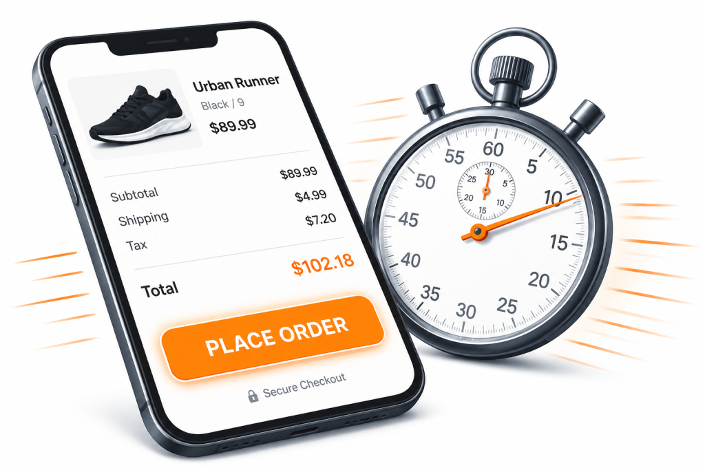
We spoke with seven SMB operators, ecommerce consultants, payment specialists, and conversion analysts about one of the most expensive moments in online retail: the checkout. Their answers reveal that cart abandonment is not just a UX problem; it’s a speed, trust, and momentum problem.

Cart abandonment kills quietly. Shoppers add items, get to the final screen, and vanish. By the time the monthly report lands, thousands of dollars in intent have already walked away, most of it preventable. What SMBs are missing, according to the operators below, isn’t more traffic or a better discount strategy. It’s smarter, faster checkout systems that respect how shoppers actually behave in the final five percent of the funnel.
From a Shopify store owner in Lahore to a payments consultant in Austin, seven experts weighed in with hard-earned lessons that range from one-tap wallet integration to the psychology of trust signals. The breadth of their answers is itself revealing: fast checkout is not one fix. It’s the compound effect of getting many small things right.
Speed Is the New Trust Signal
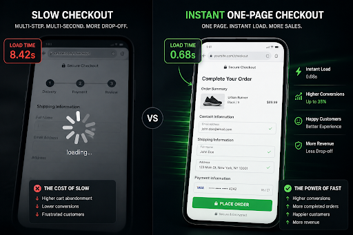 The first and most universal observation from our operators is that load time is no longer a technical metric — it’s a brand impression. A checkout that hesitates communicates risk, regardless of the business’s legitimacy.
“On mobile, every second of delay past the second-second mark roughly doubles abandonment risk on the final screen. Speed is the cheapest trust signal an SMB can buy. Customers don’t think ‘this is slow’, they think ‘something is wrong.” — Adrian Iorga, Founder & President of Stairhopper Movers
Rahman’s point is echoed by every operator we spoke with. For SMBs without the brand recognition of an Amazon or Shein, the checkout itself becomes the proof of legitimacy. A page that loads in under one second tells the shopper, without words, that this is a serious business. A page that stutters does the opposite — and the shopper rarely gives a second chance.
Eliminate Mandatory Account Creation at Checkout
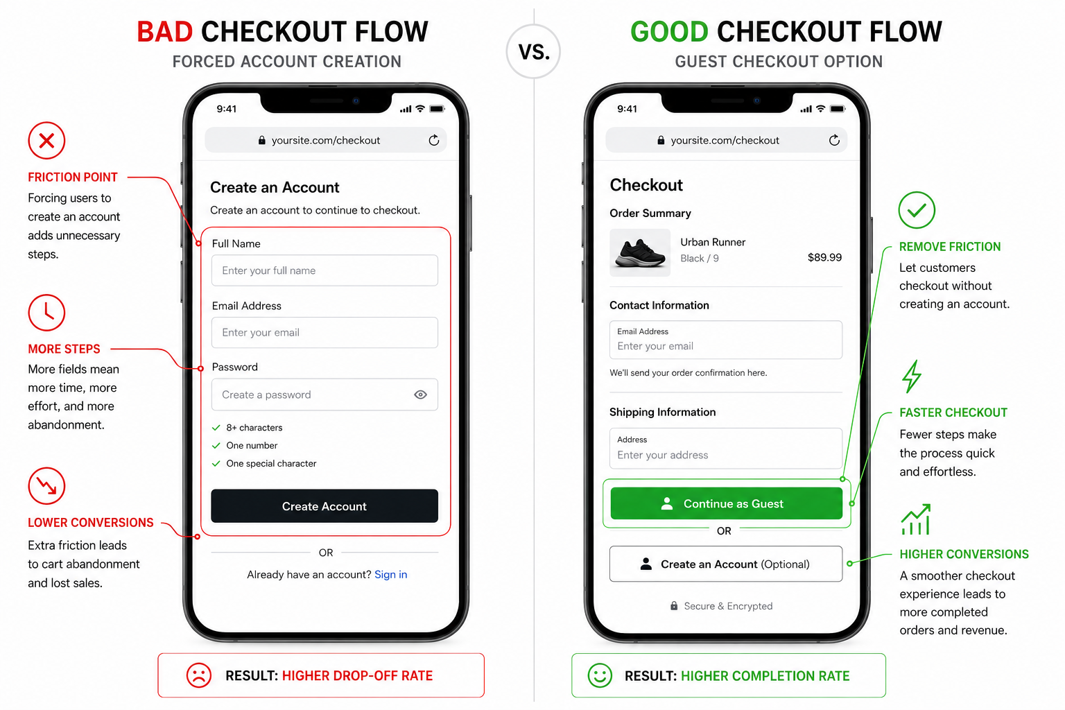
If there is one near-universal recommendation from this roundup, it is this: stop forcing shoppers to create an account before they pay. Multiple operators flagged this as the single highest-leverage change an SMB can make in an afternoon.
“People are far more likely to complete a transaction when the process feels simple and immediate. Forcing account creation too early adds unnecessary friction and often discourages first-time users before trust has even been established.” — Sharon Amos, Director at Air Ambulance 1.
Mehmood’s experience is consistent across categories. Account creation introduces fields, decisions, and an implicit obligation that many shoppers — particularly first-time buyers — are not ready to make. The fix is structural: offer guest checkout as the default, and present account creation as an optional benefit after the purchase completes, when the shopper has already received value.
One-Tap Wallets Aren’t a Feature — They’re a Floor
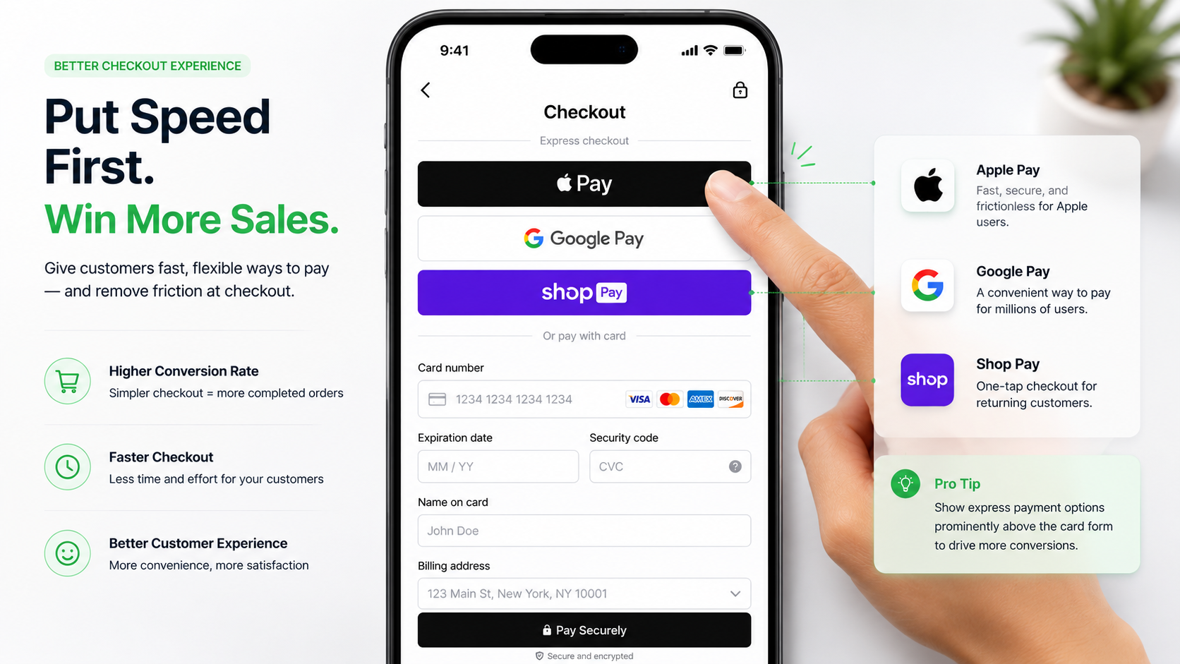
Express payments — Apple Pay, Google Pay, Shop Pay, PayPal One Touch — have shifted from optional add-ons to baseline expectations. For mobile shoppers especially, the difference between thirty seconds of typing and a single biometric tap can determine whether the sale happens at all.
“Today’s digital users are conditioned to expect speed and simplicity online. One-tap wallets like Apple Pay and Google Pay reduce friction, improve accessibility, and create a smoother learning curve for less tech-confident users during checkout.” — David Lee, Managing Director at Functional Skills.
Levitt’s framing matters because many SMB owners still treat express payments as something to evaluate. The operators in this roundup are unanimous: at this point, the question is not whether to enable wallet checkout but how prominently to feature it. Most recommend placing it above the standard card form, especially on mobile, where typing is the dominant friction.
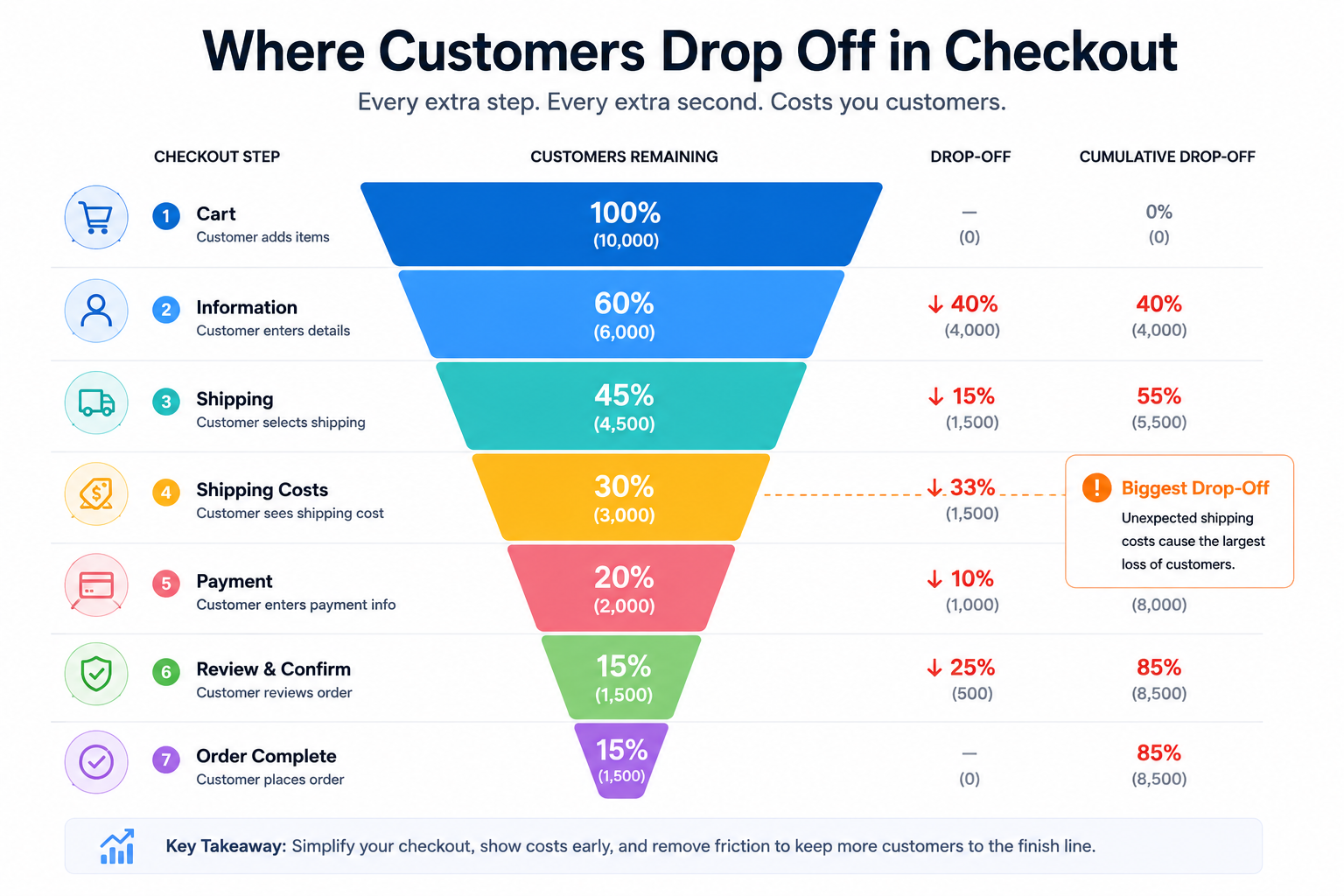
Surprise Fees Are the Number One Killer
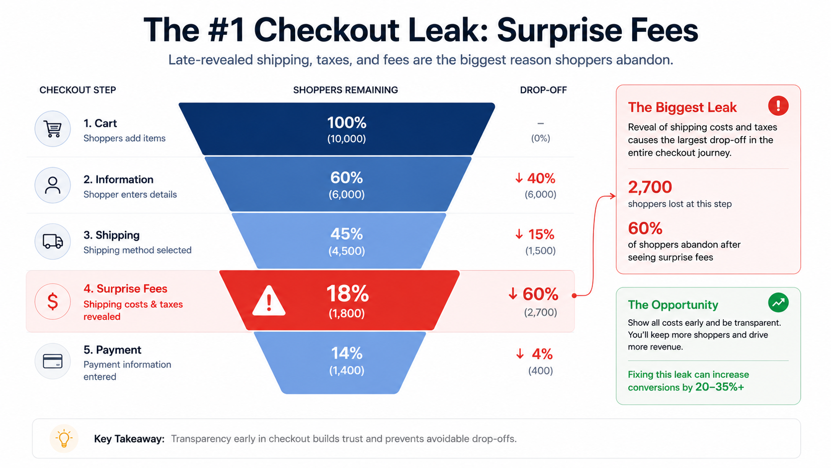 Across every published cart abandonment study, the same answer dominates: shoppers leave when unexpected costs appear. Shipping fees, taxes, handling charges, and service fees that surface only at the final step violate the shopper’s mental price commitment severely enough to break the transaction.
“Unexpected fees create hesitation at the worst possible moment. When pricing changes late in the process, customers often feel misled, even if the additional costs are legitimate. Transparency early in the journey helps maintain trust and improves completion rates.” — Muzammil Sayed, CEO of NYC Leather Jackets.
Venkataraman’s solution is simple and aggressive: surface every cost as early as possible. Shipping calculators on the cart page, location-based tax estimates, and clear messaging about any service fees turn the final checkout step into a confirmation rather than a negotiation. The shopper sees no new numbers between the cart and the order button. Momentum is preserved.
Mobile Is Not a Smaller Desktop
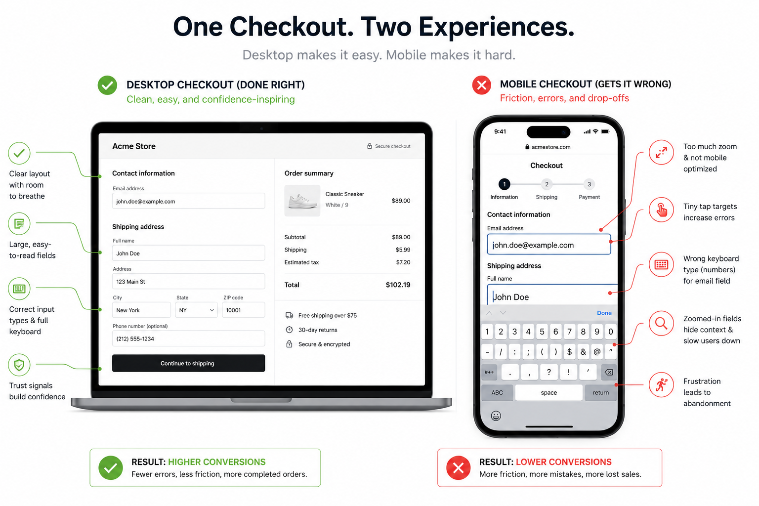
More than half of SMB ecommerce traffic now happens on mobile, yet most checkouts are still designed by people working on desktops. The result is a quiet but enormous gap between mobile and desktop conversion rates — a gap that closes only when checkout is rebuilt for thumbs, small screens, and patchy connections.
“Many ecommerce teams still optimize checkout for desktop even though most purchases now happen on mobile. Small friction points like cramped form fields, poor autofill, and slow-loading elements quickly reduce conversion rates.” — Jeffrey Zhou, CEO and Founder of Fig Loans.
Okafor’s prescription is practical: test the checkout on a real phone, on a real cellular connection, while distracted. Every place the experience breaks is a place where revenue is leaking. Pair this with address autocomplete, correctly typed keyboards for each field, oversized touch targets, and mobile-first single-page layouts, and the gap between mobile and desktop conversion narrows fast.
Every Form Field Is a Tax on the Sale
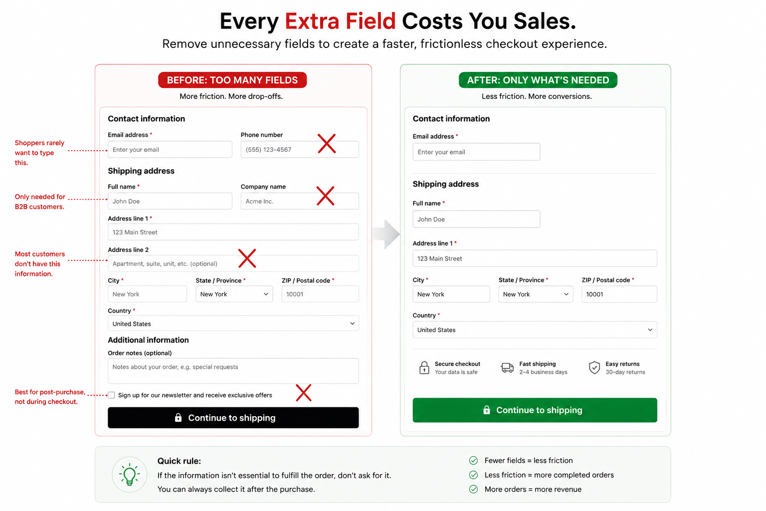
Checkout forms tend to accumulate quietly. A phone number ‘in case we need to reach you,’ a company field for B2B customers, and a newsletter checkbox that the marketing team requested. Each looks harmless individually. Combined, they slow the flow and erode completion.
Tavares’ field-audit framing has the advantage of being immediately actionable. Most SMB checkouts contain at least three fields that exist for internal preferences rather than transactional necessity. Removing them is free, takes minutes, and consistently lifts completion rate — especially on mobile, where every saved keystroke compounds into preserved attention.
The Customer Journey Doesn’t End at Form Submission
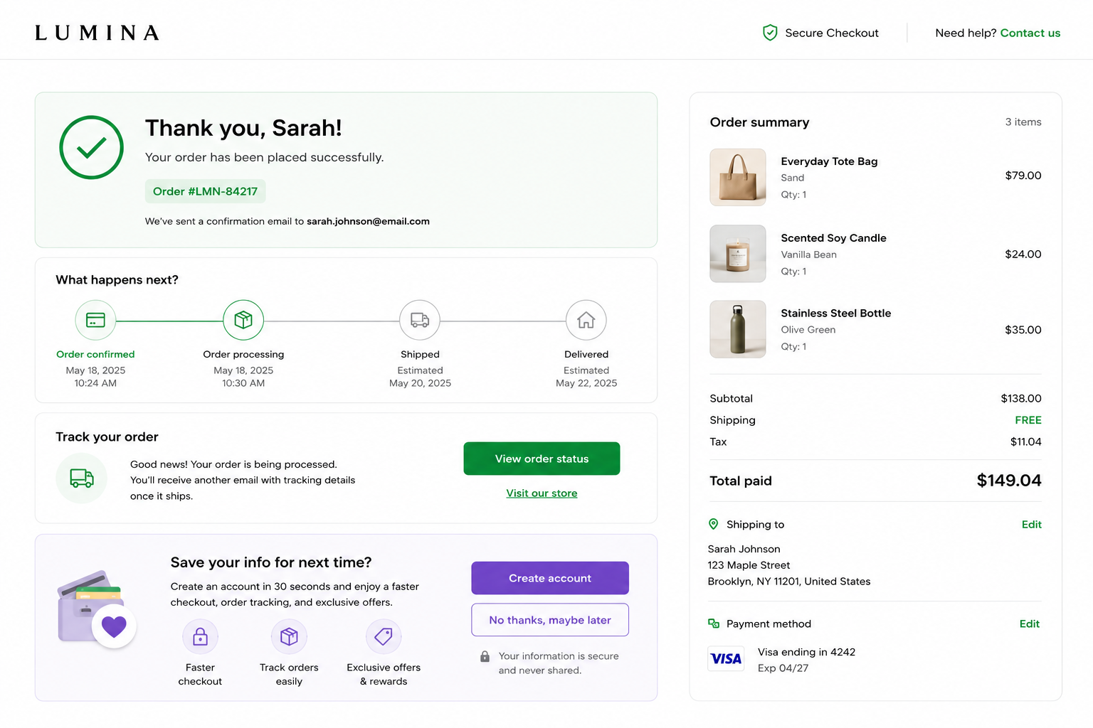 A smooth conversion experience is not just about completing the immediate action. It is also about shaping what happens afterward. Confirmation pages, follow-up messaging, and post-conversion interactions are often treated as secondary elements, even though they play a major role in reinforcing trust and improving future engagement.
“The post-conversion experience is often overlooked. Clear confirmation messaging, visible next steps, and reduced uncertainty help maintain trust and create a smoother overall customer experience.” — Karina Simonovič, Marketing Manager at Optimal Warranty.
Sheikh’s reframing closes the loop. A genuinely fast checkout is one that not only completes the current transaction smoothly but also captures the willingness, present in those few seconds of post-purchase relief, to set up an even faster experience next time. Saved payment methods, remembered addresses, and one-click reorders all begin at the moment the shopper sees ‘order confirmed’ — not the moment they return.
Trust Badges Mean Nothing If the Experience Feels Suspicious
![]() Trust badges were once treated as conversion magic. Add a padlock icon, display Visa and Mastercard logos, place a “100% Secure Checkout” banner near the payment form, and shoppers would supposedly feel reassured. But modern ecommerce behavior is more nuanced than that. Shoppers rarely stop to inspect badges directly. Instead, they absorb the overall emotional tone of the checkout experience in seconds. If the page feels cluttered, outdated, slow, or visually inconsistent, no amount of security logos will repair the underlying suspicion.
Trust badges were once treated as conversion magic. Add a padlock icon, display Visa and Mastercard logos, place a “100% Secure Checkout” banner near the payment form, and shoppers would supposedly feel reassured. But modern ecommerce behavior is more nuanced than that. Shoppers rarely stop to inspect badges directly. Instead, they absorb the overall emotional tone of the checkout experience in seconds. If the page feels cluttered, outdated, slow, or visually inconsistent, no amount of security logos will repair the underlying suspicion.
Several conversion specialists noted that trust today is communicated indirectly through polish and predictability. A fast-loading page, clean design, autofilled fields, recognizable payment methods, and transparent pricing create a stronger feeling of safety than oversized “secure payment” graphics ever could. In fact, excessive trust badges can sometimes backfire by making the shopper wonder why the business is trying so hard to prove legitimacy.
The strongest trust signal is not a badge. It is a checkout experience that feels calm, modern, stable, and frictionless from beginning to end.
Checkout Momentum Is Fragile — Don’t Interrupt It
 One of the most overlooked realities in e-commerce is that checkout behavior is driven by momentum more than logic. By the time a shopper reaches the payment screen, the decision to buy has usually already been made emotionally. The checkout’s job is not to persuade the customer again. Its job is to avoid disrupting the momentum that already exists.
Every interruption weakens that momentum. A slow-loading page, a coupon field that triggers second thoughts, a surprise shipping fee, or an unnecessary form field creates a small pause in the customer’s mental flow. That pause is dangerous because it gives hesitation room to enter. Once shoppers begin reevaluating the purchase, abandonment rates rise sharply.
Operators increasingly describe checkout optimization as a process of protecting intent rather than generating it. The fastest-growing stores are often the ones that remove the greatest number of interruptions between “I want this” and “Order confirmed.” That means fewer steps, fewer decisions, fewer distractions, and fewer reasons to stop.
In modern ecommerce, the smoothest checkout is often the one the shopper barely remembers using at all.
The Best Checkout Experiences Feel Invisible
The highest-performing checkout systems rarely feel impressive in the moment. They do not overwhelm shoppers with features, animations, or aggressive upsells. Instead, they feel almost invisible. The customer moves from cart to confirmation with so little resistance that the transaction feels natural and uninterrupted.
This is increasingly the standard consumers expect after years of using platforms like Amazon, Apple Pay, Uber, and Shop Pay. Those systems trained shoppers to associate convenience with professionalism. SMBs competing online are now judged against that benchmark, whether they realize it or not.
Invisible checkout design is built around reduction. Fewer fields. Faster loading. Smarter autofill. Cleaner layouts. One-tap payment options. The goal is not to make the checkout look technologically advanced. The goal is to make the customer forget the checkout exists entirely.
That shift matters because e-commerce competition is no longer only about products or pricing. In crowded markets, the buying experience itself becomes part of the product. A checkout that feels effortless leaves the shopper with a subtle yet powerful impression that the business itself is reliable, modern, and worth returning to.
What These Insights Have in Common
Read together, these 10 perspectives point to a single underlying truth: checkout conversion is not a feature problem. It is a discipline problem. The operators who consistently outperform their category are not the ones who built something exotic. They are the ones who took the basics seriously — speed, trust, transparency, mobile, and minimalism — and refused to let them drift.
Several patterns repeat across the conversations. Shoppers behave on momentum, not deliberation, once they reach checkout. Trust is built and destroyed by milliseconds and unexpected numbers, not by long copy explaining your refund policy. The shopper’s phone is the actual point of sale for most SMB stores, even when the data dashboards still treat desktop as the default. And every single field, click, and load delay is a tax on a sale that has already been won.
The seven operators here represent a small ecommerce business owner, a conversion lead, a payments consultant, a director of ecommerce, an indie founder, a UX strategist, and a retention specialist. The fact that all of them, working in different roles in different cities, converged on the same core message is itself the strongest possible argument that fast checkout is not a stylistic preference. It is the baseline operating standard for any SMB that intends to compete in the next five years.
Cart abandonment is preventable. The tools to prevent it are mostly free, mostly built into the platforms SMBs already use, and mostly a matter of paying attention. The businesses that take this seriously will compound a quiet, durable advantage over the ones that don’t. In an environment where every visit is expensive, and every competitor is one tap away, the speed and quality of the final five percent of the buyer’s journey determines the outcome of everything that came before it.
Invest accordingly.