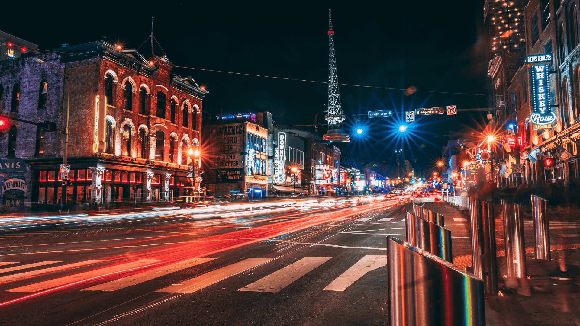
Street advertising demands clarity above all else. People encounter it while walking, driving, or commuting, often with little time or attention to spare. Unlike digital or indoor media, street design must work instantly, in uncontrolled environments and changing conditions. Effective results come from disciplined design choices that prioritise visibility, comprehension, and relevance. The elements below are the ones that consistently perform on the street.

Clear Typography
Typography is the backbone of street design. If the text cannot be read quickly and easily, the message is lost. Simple sans-serif fonts perform best because they remain legible at a distance and at speed. Thin strokes, decorative letterforms, or condensed typefaces reduce clarity and should be avoided.
Text should be minimal and direct. A short headline is far more effective than multiple lines of copy. Spacing also matters; adequate letter and line spacing improves readability in poor lighting or crowded visual environments. When considering street advertising and poster campaign options, typography must always be chosen for function first, not style.
Strong Colour Contrast
Colour plays a critical role in attracting attention on the street. High contrast between background and foreground ensures that messages remain visible against busy urban backdrops filled with signage, traffic, and movement. Light text on dark backgrounds, or vice versa, consistently performs better than subtle tonal differences.
A limited colour palette helps maintain focus and strengthens recall. Too many colours compete for attention and dilute the message. Designers must also consider how colours behave under sunlight, shade, and artificial lighting, as outdoor conditions can significantly alter colour perception.
Simple Layouts
Street advertising works best when layouts are clean and uncluttered. A clear structure allows the viewer to understand the message instantly, without needing to search for meaning. The main message should dominate the design, supported by imagery and minimal secondary information.
Overly complex layouts slow comprehension and reduce impact. Decorative elements that do not serve the core message should be removed. Strategic use of white space helps isolate key information and improves clarity in visually noisy environments.
Correct Use of Scale
Scale must be appropriate for viewing distance and speed. Design elements that appear balanced on a screen may be far too small once printed and installed outdoors. Headlines, images, and logos should be sized so they can be understood from where people naturally encounter them.
Pedestrian-focused placements can support slightly more detail than roadside ads viewed by drivers. Designers should always account for distance, movement, and viewing angle when determining scale, as misjudged proportions are a common cause of underperforming street ads.
Direct Visual Imagery
Imagery must communicate instantly on the street. Complex scenes, abstract concepts, or layered visuals take too long to process in fast-paced environments. The most effective visuals are simple, bold, and recognisable at a glance.
High-contrast photography, clear illustrations, and focused subjects perform best. Background detail should be limited so the main visual does not compete with its surroundings. When an image requires explanation, it is unlikely to work in an outdoor setting.
Design That Fits the Location
Street design does not exist in isolation. Walls, textures, street furniture, and neighbouring signage all affect visibility and impact. A study on the aesthetic perception of city outdoor advertising found that elements such as “reasonable and eye-catching placement,” “appropriate size and proportion,” and “environmental adaptability” are essential for viewer satisfaction, reinforcing the importance of context in ad effectiveness.
Designs must account for these physical factors to avoid blending into the environment or being partially obscured. Effective street advertising either contrasts clearly with its surroundings or works intentionally with them. Surface colour, material, lighting conditions, and pedestrian or vehicle flow all influence how design elements perform once installed.
Focused Messaging
Street advertising leaves no room for distraction. Every element should support the primary message, and anything unnecessary should be removed. Excess text, additional graphics, or competing ideas dilute effectiveness.
The strongest street designs communicate one clear idea quickly. When the message is understood instantly, it is more likely to be remembered later. Focus improves both comprehension and recall.
Why These Elements Decide Street-Level Success
Design elements that work on the street are practical, not decorative. Clear typography, strong contrast, simple layouts, correct scale, direct imagery, location-aware design, and focused messaging determine whether an ad is noticed, understood, and remembered. When applied with discipline, these elements allow street advertising to cut through visual noise and perform effectively in real-world conditions.

Peyman Khosravani is a global blockchain and digital transformation expert with a passion for marketing, futuristic ideas, analytics insights, startup businesses, and effective communications. He has extensive experience in blockchain and DeFi projects and is committed to using technology to bring justice and fairness to society and promote freedom. Peyman has worked with international organizations to improve digital transformation strategies and data-gathering strategies that help identify customer touchpoints and sources of data that tell the story of what is happening. With his expertise in blockchain, digital transformation, marketing, analytics insights, startup businesses, and effective communications, Peyman is dedicated to helping businesses succeed in the digital age. He believes that technology can be used as a tool for positive change in the world.


